Quick Little Colour Studies
Oil colour studies on tinted gesso primed paper
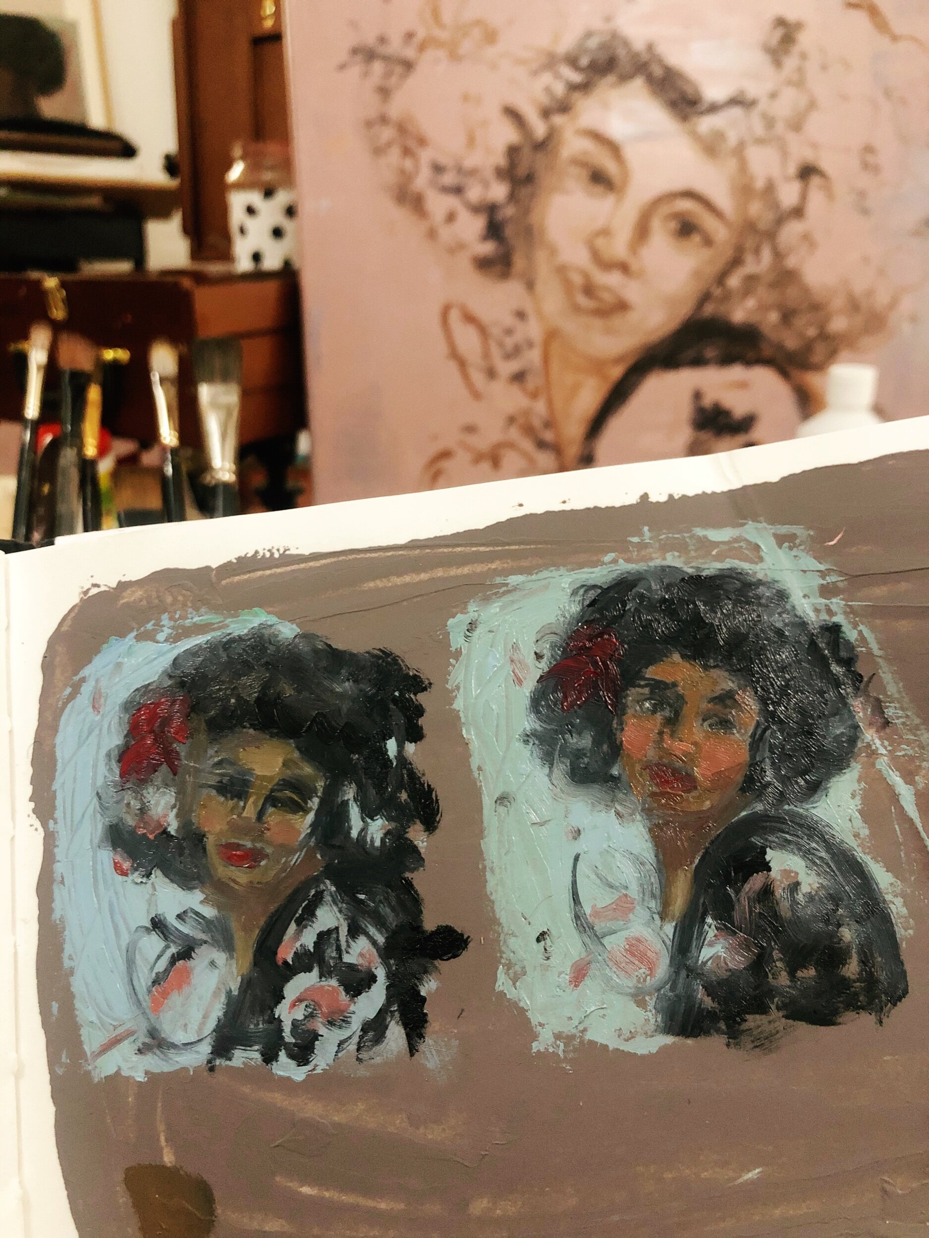
Here are a couple of very quick little colour studies for a larger painting I will be doing. Since I don’t have a photo reference to work from, I wanted to test the waters to ensure I am happy with the colour structure before I jump into the full sized painting.
Usually when I am working from a photo reference, I will have already adjusted or altered the colour and value structure before I paint, meaning I can use the image on my ipad as a guide to match the colours as I paint and refer to the photo/mockup image.
In this case, I began with a pencil sketch which which I later imported into to Procreate to manipulate and create a design I felt happy with. While this digital sketch has a little colour, it is more of a value guide than fully formed photo reference. I wanted to reassure myself that the image will still work once I substitute my pencil shading for colour. While I could have continued adding more colour digitally in Procreate, I felt it would be more effective to work in oils to mix the colours I was sure I needed (the blue background, dark hair and blouse) and and see how they sit next to a cooler or warmer skin tone.

Pencil & digital sketch
Working on a previously primes page in one of my sketchbooks, I used a palette knife to loosely block in little versions of my design. Using a palette knife rather than a tiny brush helped to keep the focus on the overall big shapes, ignoring detail and also allowed me to move quickly across the page without being precious.
For me, the benefit of doing preliminary oil sketches is that it helps to clarify my vision, taking away some of the guesswork. It also takes away some of the pressure to deliver in the main painting. I find being able to see and refer back to a physical iteration of a painting in the same end medium, is more directly relatable than an image on a screen.
Looking at the two studies, I prefer the second one which has a warmer palette and slightly greener blue background. This will be helpful to use for colour matching as I mix new paint for the final painting.